
Over forty presentation software out there. Canva, Piktochart, Visme, Prezi, GoogleSlide, Haiku Deck and Powerpoint – to name a few. They can help you design your next presentation, or can they? I’ve covered some of top presentation tools in my free MOOC ACE That Presentation. It’s where you can certainly pick up more than 30 useful strategies and tips in designing your presentation. But which is the best tool, you might ask?
That question begs you to identify your needs and wants. Especially when you’re tired of PowerPoint… and seeking for alternatives. First of all, decide if you want to present offline or online. For offline options, you have Powerpoint, Canva, Haiku Deck, Prezi and Keynote.
Then, if you wish for an online presentation software that gives you fresh designs, stylish and super easy–sign up for Canva. For something dramatic and engaging, try Emaze as an online presentation tool. The downside is it’s data-guzzler.
If you have plenty of graphs and diagrams to present, Piktochart could be your answer. And Prezi… would be great for afternoon’ish presentation. When designed properly, you can craft a Prezi that dazzles your audience and keeps them wide-awake.
However, when you explore the tools above, you would soon realise what it can do and what it can’t do. Each would have the pros and cons. The pros should support your needs and wants; the cons shouldn’t restrict or put your pitch in jeopardy.
The journey starts with acetates and OHP
I began looking for a tool that supports and lets me explore the creative (& uncreative) side of me. There is this habit of mine that would scour for any new presentation tool.
That journey started more than 20 years ago. It started with MS PowerPoint 95. I remember it was during my pre-registration training as a house-pharmacist at Hospital Ipoh. My first encounter with PowerPoint. I was asked to stand-in for a senior pharmacist and deliver a short talk to discharged patients on hypertensive drugs. There were acetates but I dabbled with this version of Powerpoint. The teaching tips from my late dad helped me design my first Powerpoint presentation.

an acetate. By mailer_diablo (Self-taken (Unmodified))
[GFDL (http://www.gnu.org/copyleft/fdl.html) or CC BY-SA 3.0 (https://creativecommons.org/licenses/by-sa/3.0)], via Wikimedia Commons
I remember bits and pieces of my late dad’s acetates. One of his teaching aids that he would bring home after work. Stacks of colourful acetates and their markers. The markers gave a unique high-note smell. I remember playing with them. Plenty of doodling opportunities. And learning too.
Seeing me doodling with the acetates, my late dad would pull me aside and start sharing about his work. He would patiently explain and show me how each of the coloured cut-outs or layers on the acetates worked to the overall design and contents. How the rectangular cut-out bits would help his students understand better.
Even though I was probably around 10 years old, it made perfect sense. I realised I have been using the same principles my late dad taught me ages ago. The layering stood out the most. The OHP and acetates have been replaced with LCD projector and presentation software. Certain things remain the same; only times have changed.
And my journey continues. In pursuit for the best presentation software.
Over time, I realised there is one presentation tool that keeps letting me express my ideas in multitude of ways as a presenter, a presentation designer, a scientist and an educator. Beautifully too.
It’s Apple Keynote.
For the previous slide deck on cardiac glycosides, I use Keynote–my preferred presentation tool. My top 5 go-to-app even for design blog post images, quick social media posts. Some design examples (a), (b) and (c) using Keynote.
Design diagrams with Keynote
I’m sharing a diagram of an action potential from heart muscles drawn in Keynote as shown below and shared in my previous slide deck. Keynote has a line tool that you can further manipulate into shapes. Or you can modify any shapes or icons in Keynote to your liking. It took me about 20 minutes to create the following diagram (low resolution shown) for my presentation. Great 😀
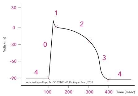
Then, I numbered the phases of this action potential from 4 – 0 – 1 – 4. Like Canva, Keynote provide a good selection of nice fonts for professional use–something I often share in my presentation workshops. That will help invigorate your dull presentation.
In less 300 microseconds, many events occur during these phases 4 – 0 – 1 – 4. Phase 4 is resting potential for a myocardiac tissues, 0 represents depolarisation and 1 – 3 are re-polarisation phases. The important ones are the influx/efflux of salts, sodium, potassium and calcium. All critical for pumping of the heart. And quite a lot to digest.
But if I follow one of my dad’s acetate tips, that is to present the large amount of information bit-by-bit, then it should work. So I plan to present this event in sequence to my students, as it happens in the heart. From my heart 😀
So what’s the best presentation software?
I have to confess I don’t have the best one. But if you have come this far, I will reveal in a moment the why’s.
The way I see it, not all presentations are created equal. Or for the same purpose.
A presentation created for a keynote talk should be designed differently from a lecture. A presentation for a workshop differ in many ways than a research seminar. To this end, I have several go-to-apps that work for different purposes.
For instance, Sway would be my preferred presentation software for my workshop on presentation. Find out how to Sway and why.
My favourite app for teaching and Interactive Lecture workshops used to be Blendspace. Chiefly because I loved to fill out the boxes by simply drag & drop multimedia contents e.g. videos, pdf, Powerpoint. Share the Blendspace link with your students. All the learning materials are in one place; they can watch a video, review a Powerpoint and read a pdf without having to open them in separate windows. Plus it’s available as an iPad app. So convenient and versatile.
At number 2 and 3…
Ranked at number 2 and 3, respectively, are Canva and Piktochart. I design my presentations using these two tools when I want something fresh, eye-catching and contemporary for my audiences.
Watch this video presentation at TTLC2018. I created this presentation using a template on Canva. A 16-minute preso. The template has a nice light green + grey design that is easy on the eye. Because I have some research data and photos, it took about 1 hour plus to design this preso. Then I spent another 30-40 minutes to create a video presentation using Screencastify. The design and video recording took place in a hotel room somewhere near KLCC. Right after that I needed to go to IUCEL in IIUM.
Thus, the great things about Canva and Piktochart are that these presentation software provide well-designed templates. Just point and click. Add content. And you are good to go. Or share with others on social media. They serve a purpose.
And the top spot goes to…
Now, for presentation design, reigning at the top spot is Apple Keynote. I’ve been using it since I got my first Macbook, fifteen years ago. Most of my teaching slides are designed using Keynote. The sample slide deck featured in the classic presentation book, Presentation Zen i.e. ‘Aromatic Chemistry’ were designed and delivered using Apple Keynote.
Additionally, I designed my entire ACE That Presentation MOOC – from the slide deck designs, logo, thumbnails, colour scheme, font family – using Keynote. It’s a 4-month DIY effort – day in, day out, several times in the weekends. A distillation of 13-year experience* in presentation design and delivery in higher education – all can be learned in 4 weeks 😎
I found Keynote so simple and intuitive to use.
It’s powerful. And it provides the space for unleashing my creativity. Again and again. That I do not wish to go back to Powerpoint, if possible.
By the way, do you know that if you have iCloud account, you can use Keynote (and iWork) online? That is, you don’t have to own a Mac to start designing a beautiful presentation. Why don’t you give it a go… 🙂
*Longer if I include the time with my late dad 😉

Comments are closed.