
In this blog post, I share 15 tips (and more) on how to ace a medical presentation during your undergraduate years. This post also includes a couple of powerpoint slide makeover by uncluttering busy slides. The makeover slides demonstrate the power of simple and clean designs for an effective medical undergraduate presentation.
Recently my family and I were in Kota Bharu and met up with my niece, Aina. She is a medical student at the Health Campus, Universiti Sains Malaysia. During our meet, she asked how to give a good presentation to medical students? Aina’s a part of a big group that would talk on ‘Child Abuse’. The topic for her sub-group was further narrowed down to ‘Sexual Abuse in Children’.
A challenging topic to talk about, in my opinion.
Challenging because the topic is considered a ‘taboo’? in our society–nowadays, people would rather talk about “what meal you just had in IKEA?” Furthermore, most likely it would be heart-wrenching and quite graphic, literally. I could not imagine presenting otherwise. The topic touches on the raw nerves of many people, particularly parents and children.
Yet it is necessary to talk about it. It’s a good exposure to medical students, the future doctors. They need to know how to handle such cases with professionalism, compassion and utmost care.
The ‘before’ slides
After getting a better idea of what’s the talk was about, Aina showed me a draft of a Powerpoint presentation that they’ve come up with.
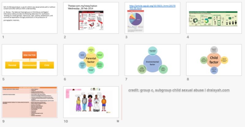
Except for the middle slides, it’s texty with a mixture of diagrams/tables of different colours that lacked a sense of direction and consistency. Oh dear… ?

It’s like being lost in a thick tropical jungle (of text and diagrams). Well, unless… you have great ‘navigational’ skills to quickly read the cues and clues from Nature and find your way out.
This often happens when the slides are prepared by 2-3 people in a group… I saw this type a lot with my students’ presentations.
Time for a makeover! 😉

Tips for a great presentation for medical students
The following are some tips I shared with Aina:
- At the heart of any presentation is to keep it simple, if not simpler. Do another set of slides – clean and simple ones.
- Share the current powerpoint with your classmates, and
- Turn this general presentation into a case study. Make it personal, meaningful and dramatic them.
Aina: OooOooOOooo…….. Present like a TED Talk!
Me: Yes… that’d be cool 😀 When everyone else would presenting in a ‘standard’ manner, why don’t you do something different? Like switching off the lights and continue talking.
Aina (in a surprise tone): Boleh ke? (Is that allowed?)
Me: Hehe… why not? I’d done it with my pharmacy students. Try~lah 😉
The ‘after’ slides
A week later I got a Whatsapp message from Aina. She shared a video of the sub-group presentation, where she presented on behalf of her team. According to her, they managed to standardise the slides (as follows).
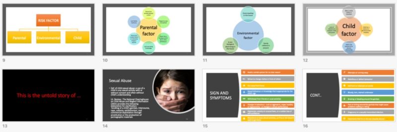
Not bad at all, considering they had just a few days before the seminar. I also learned that it took them a lot of practice to sync the slides to the presentation–with a surprise included. Sweet, perfect timing!
Good job Aina and the team mates!?* Watch the presentation here.
More presentation tips for medical students
I had a look at the slide deck on ‘Child Abuse’. My honest feedback: in general, the slides are quite crowded and overloaded with information. Such slides are great for revisions if this topic comes out in the exams, but hardly ‘optimised’ for a presentation. Thus there are plenty of ‘rooms’ for improvements.
That said, several really nice ones are shown below:
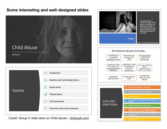
My take and tips on the above slides:
- The title slide looks great. One photo on a slide. Very relevant – it captures the emotion of a child abuse victim and sets the tone for the session.
- The use of icons is trendy nowadays; it’s nice to see them in an outline slide.
- Considering the seriousness of the topic, the outline slide uses simple and clean designs yet unique–easy to follow by the audience. Plus they’d know what they are in for.
- Likewise, for the rest of the above slides. I really like the colours and shapes – they lighten up a serious topic.
In short, the slide deck would look even better if the layout, colours, diagrams and information are consistent, concise and in harmony with one another.
The purpose of a slide is to support you, the presenter–and not to steal your thunder!
How to let slides steal your thunder!⚡️
In the digital age, information is at your fingertip. Ask your Uncle Google or Auntie Youtube, you’d likely get an answer. Haystacks of answers or information. It’s everywhere that we are inundated with information. Information overload turns people off.
Slides crammed with information would trigger the same effect. Adversely, it could steal your thunder. Presenters (unconsciously) do this all the time.
How?
Distracting your audience: Busy slides have the knack of distracting your audience. When a slide has too many points, your audience don’t know where to focus–you or the slides. So they’d turn to their phones or chit chat and not listening to your talk.
Causes ‘indigestion’: Even if we would like to think that we are a super-duper human that can take in lots of information, TMI could overload one’s senses and intellectual capacity. Information indigestion is a likely result. We need time and space to digest things (e.g. information, food) before they can be turned into something meaningful and of value (knowledge, nutrients).**
Too texty: Your audience would take longer to read slides busy with text. Before they could read the entire slide, you move on to the next one. Repeat it a few more times, you would turn an attentive audience into an irritated or annoyed one. They’d turn off.
Worse, they pretend they have understood your presentation…
So, three ways how busy slides can steal your thunder and make your presentation less effective.
Check out earlier blog posts on academic presentations:
1. How not to look boring
2. Elevate your research presentations!
3. Secret sauce of an academic presentation
Powerpoint makeover: Tips for medical undergraduates
A presentation on a topic is often concise, succinct and to the point. Performed well, a presentation could be a way to create awareness, educate and persuade your audience. Well-designed slides would help your audience–patients, peers, nurses, consultants–understand your points better. Plus, good presentation skills could help advancing your career.
The following are two slides with tips for a makeover:
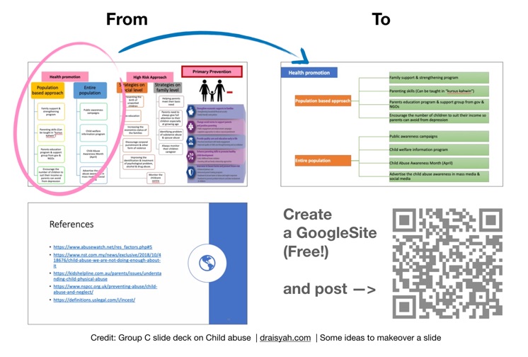
The first slide has too many points with 3 big ideas. It’s best to split the three big ideas into 3 slides. The designer for this slide (and others) is quite smart when he/she used SmartArt Designs. One can quickly create nice diagrams/flowcharts in a few clicks. It’s a great productivity tool in Powerpoint.
In the slide makeover, a horizontal design of the multiple points looks cleaner, easier on the eye than laying them out in a vertical manner.
The second slide shows links to references used for the presentation. Does anyone have the time to note down all the links during the presentation? If not, I suggest to turn these into a website. Share the website link as a QR code where the audience can scan it with their mobile phones.
Better, share the links as a Blendspace. Check out my Blendspace on Avoid Death By Powerpoint with Powerpoint Alternatives.
Summary
The following list outlines 15 tips shared in this blog post for effective medical undergraduate presentations:
- Keep it simple, if not simpler
- Present like a TED Talk
- Make it personal, meaningful and dramatic
- The purpose of a slide is to support you, the presenter
- Design in bite-size to reduce ‘information indigestion’.
- One photo (or one point) on a slide
- Use of icons (e.g. Flaticon) in your slides
- Less is more (Less busy, less text, more impact!)
- Choose colours and shapes wisely – they can help lighten up a serious topic
- Standardise the slide designs – elements should be consistent, concise and in harmony with one another.
- Practice, practice and practice
- Sync the slides to your speech
- Include a surprise or two
- SmartArt Design – a great productivity tool in Powerpoint
- A good presentation is concise, succinct and to the point.
That’s all guys. Hope you’d find these 15 tips useful in helping you prepare for your next presentation. Let me know your thoughts in the comment box below.
*Sorry, can’t help it… of course, I’m biased 😉
**Yet it is interesting to note that we tend to force many things through, rather than let things to run its course naturally.
Comments are closed.