I simply love how data are being presented (or represented) in Data Viz project by ferdio, a company specialising in infographics. Though it’s a project in beta stage, I found the website, which itself is an infographic, displays a wonderful array of data visualisation. Furthermore, data visualisation is categorised by families (chart, plot, table), data input (raw data to visualisation), function (e.g. distribution, trend) and shapes. If you click on each data visualisation, it gives brilliant examples of how a data set is visualised. Good for newbies. Also for people who look for alternative ways to present data.
My favourites from Data Viz project website are as follows:


These data visualisations are a part of DataVizProject by Ferdio, licensed under CC BY-NC-ND 4.0
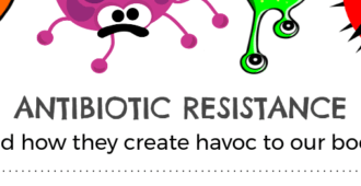
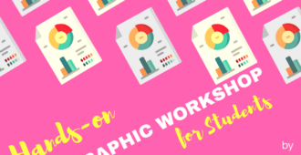
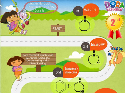
These data visualisations are quite useful in engineering, sciences and healthcare fields. In USM School of Pharmaceutical Sciences, creating infographic for health awareness is an undergraduate student group assignment. You can also use these data visualisation sets in your presentations (as shown in the top image). See examples of my previous students’ infographics for Central Nervous System and Therapy course (2015) and a recent example used in my infographic workshop.
To find out more on infographics, e.g. what is infographic, how to create one, you can visit two informative sites, Coolinfographics and ‘Infographic for Busy Educators‘. These two sites would really useful for students. You’d find more useful resources on presentations in my Blendspace and front page.
Below is a lego infographic of an infographic.

What matters is how you turn boring numbers/data into an engaging story for your audience. A thoughtful (and playful) combination of the above data visualisations are good enough to tell a visual story with data. Have fun!